Toroi
Graphic design, Social media, Copywriting, eCommerce, Production, Strategy, and Branding.
Toroi Bootlegs is a parody screen printing project my friend and I started in order to learn the process and print fun clothing for ourselves and our friends. We split the capital costs, dove into the process, and quickly discovered a world of frustration. After trial and error, we finally began printing shirts worthy of pride. We made our money back within the first six months and continue to occasionally print small batches for pleasure and commission today.


Design
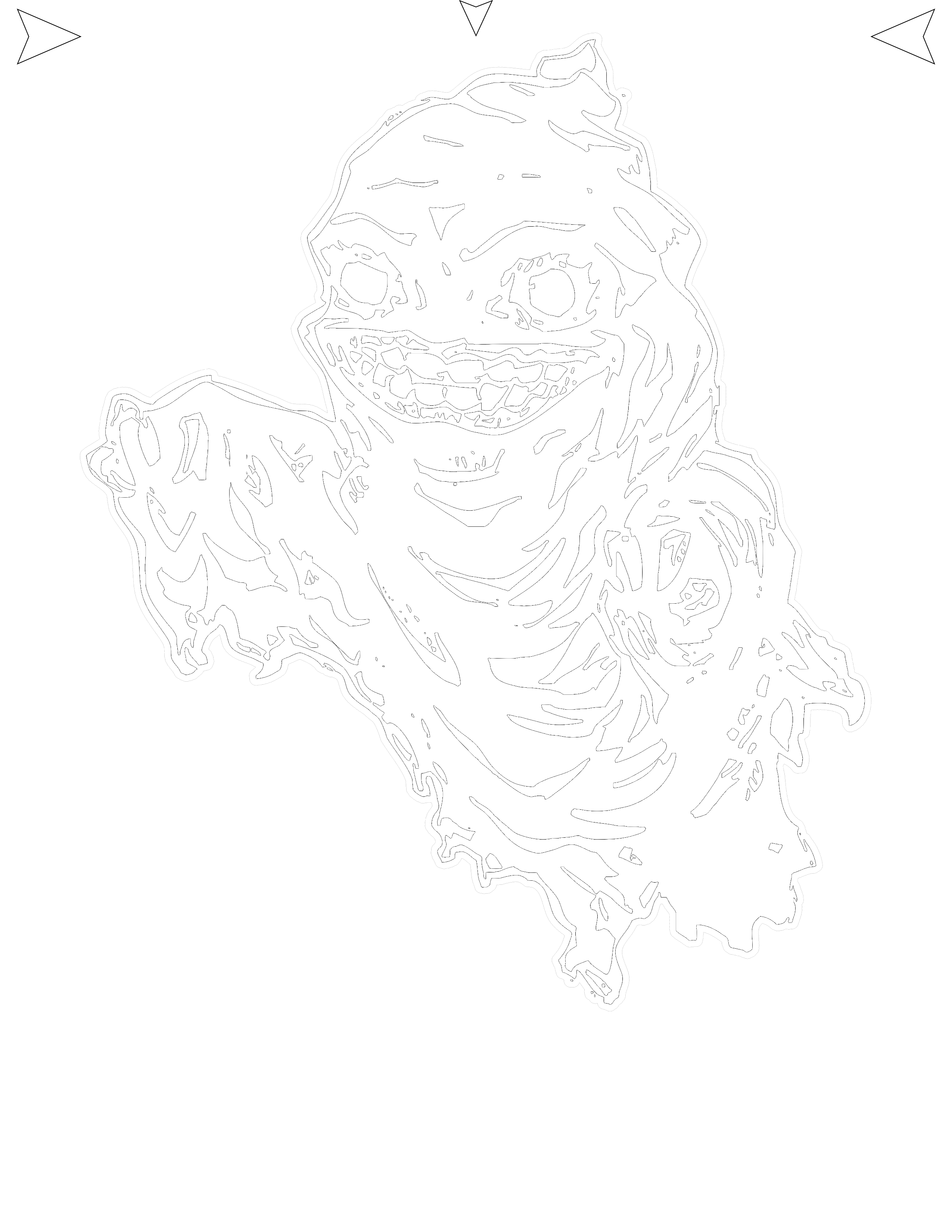
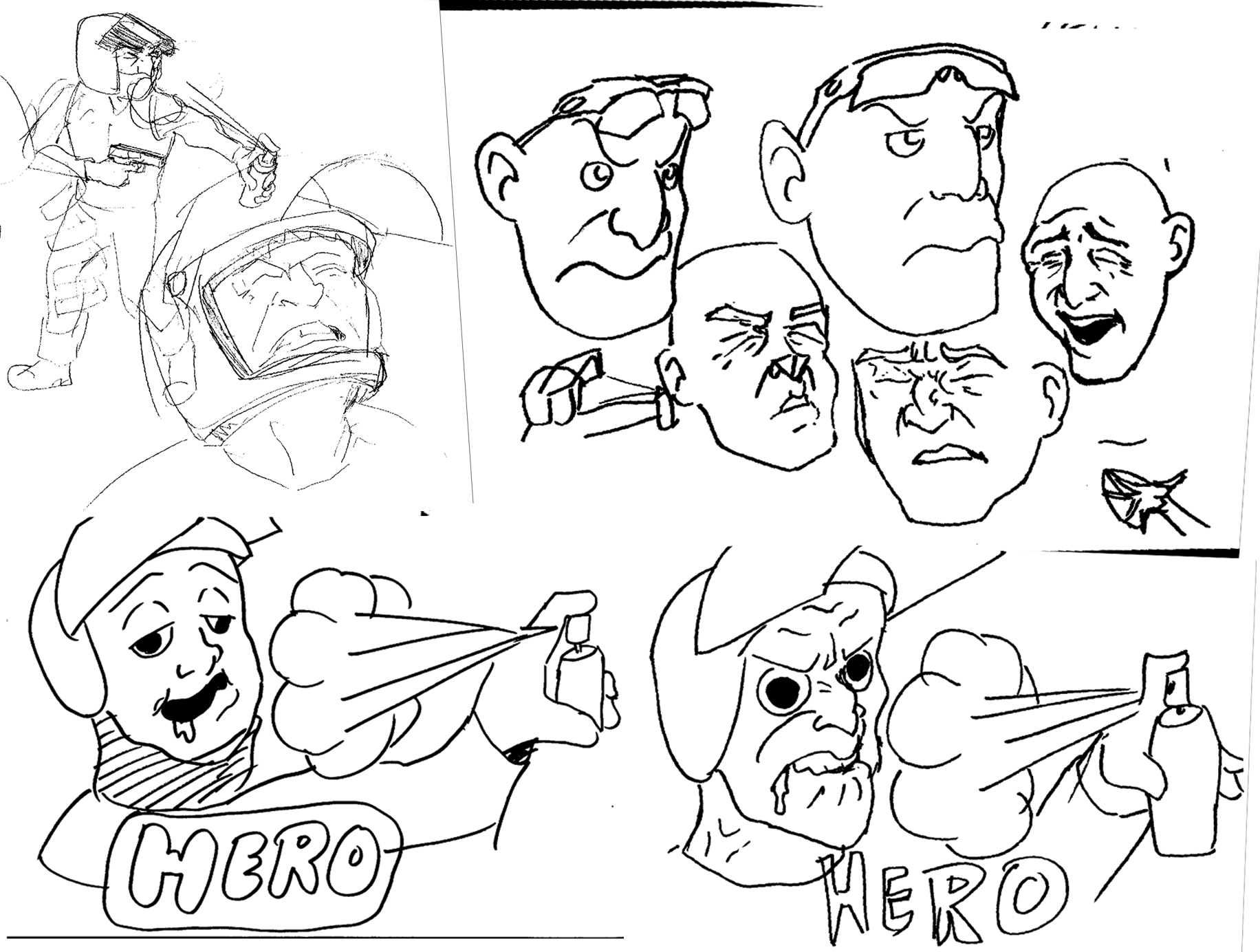
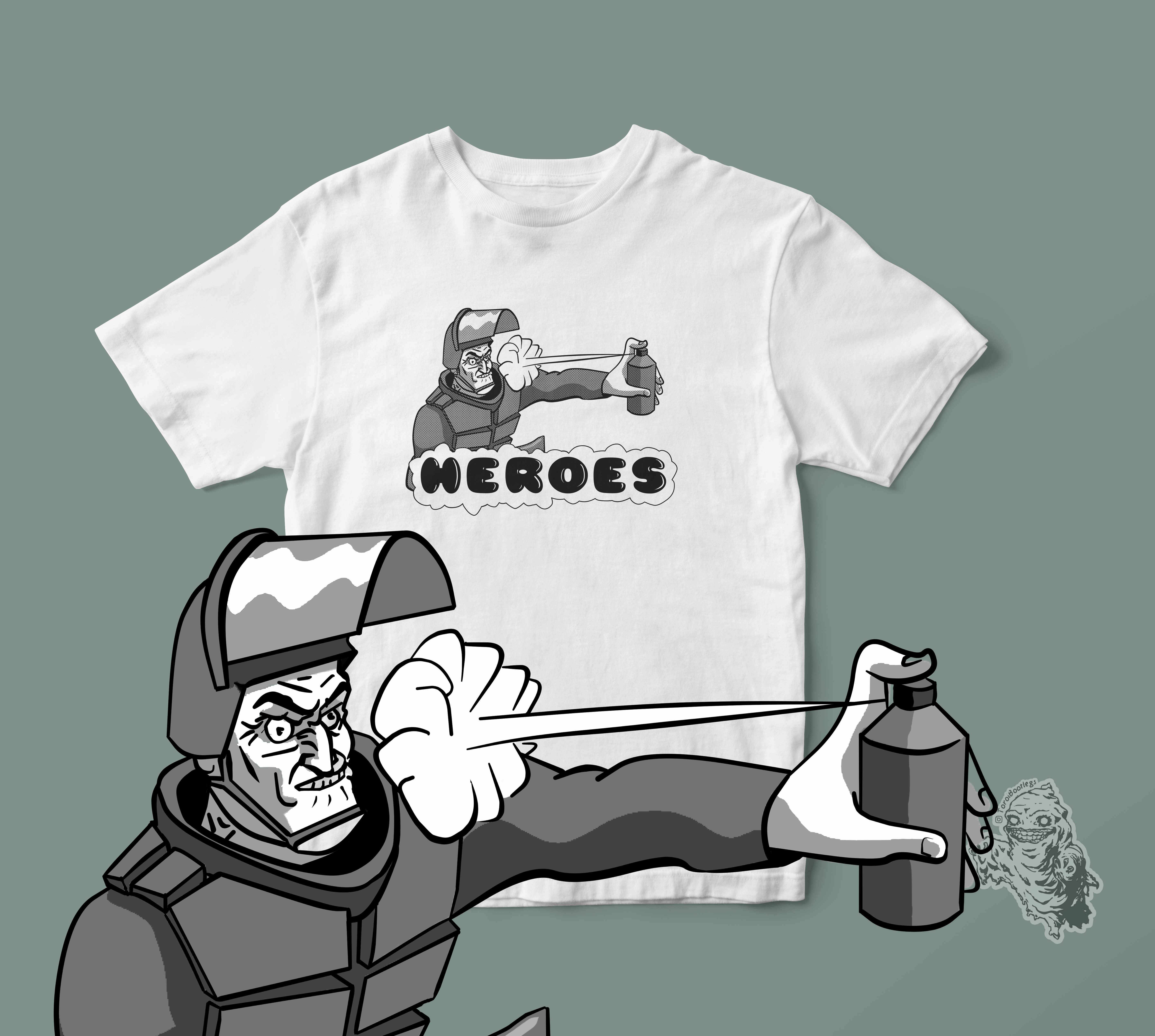
Every design starts with a concept, expounded upon through iterations involving sketches, brainstorming, and more. The result is a polished graphic ready for a variety of applications including single or multi-color designs, embroidery digitization, as well as mock-ups for social media posts, product images, and even stickers.
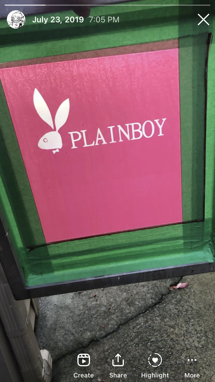
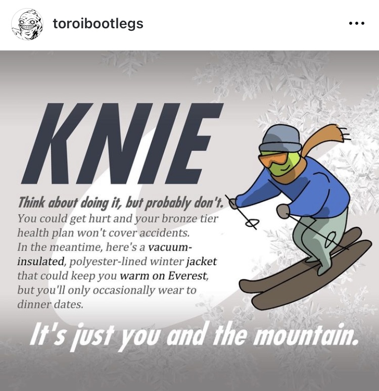
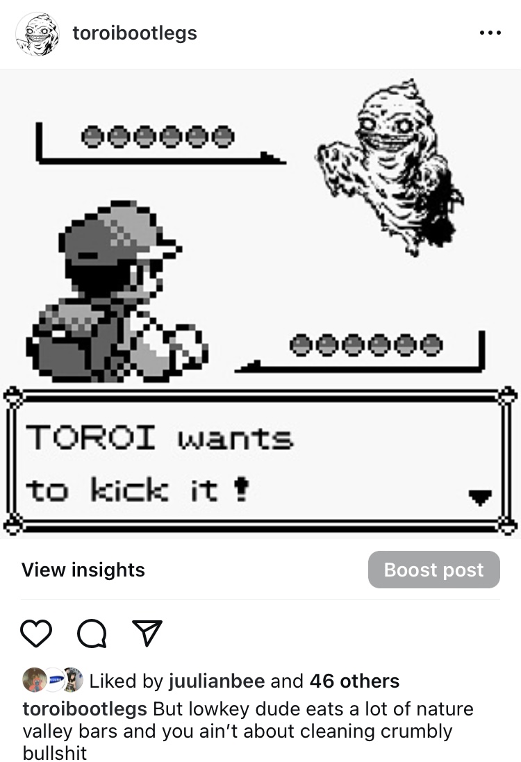
Workflows obviously depend on intent. The usual products consisted of parodying popular streetwear brands, but we'd occasionally produce work in light of timeliness, human interest, and proximity. In other words, if it were newsworthy and interesting to us, we'd make it.
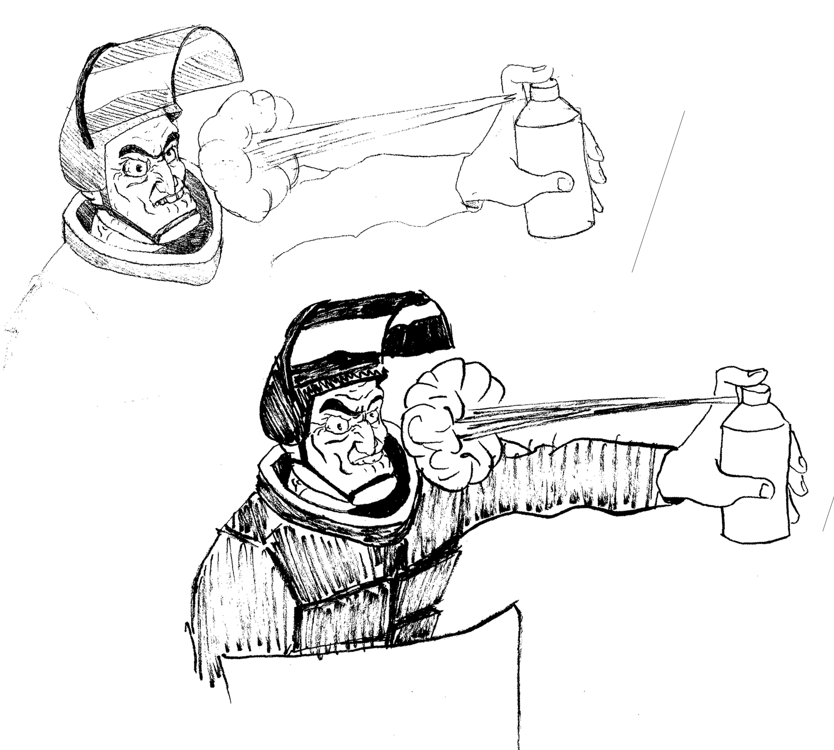
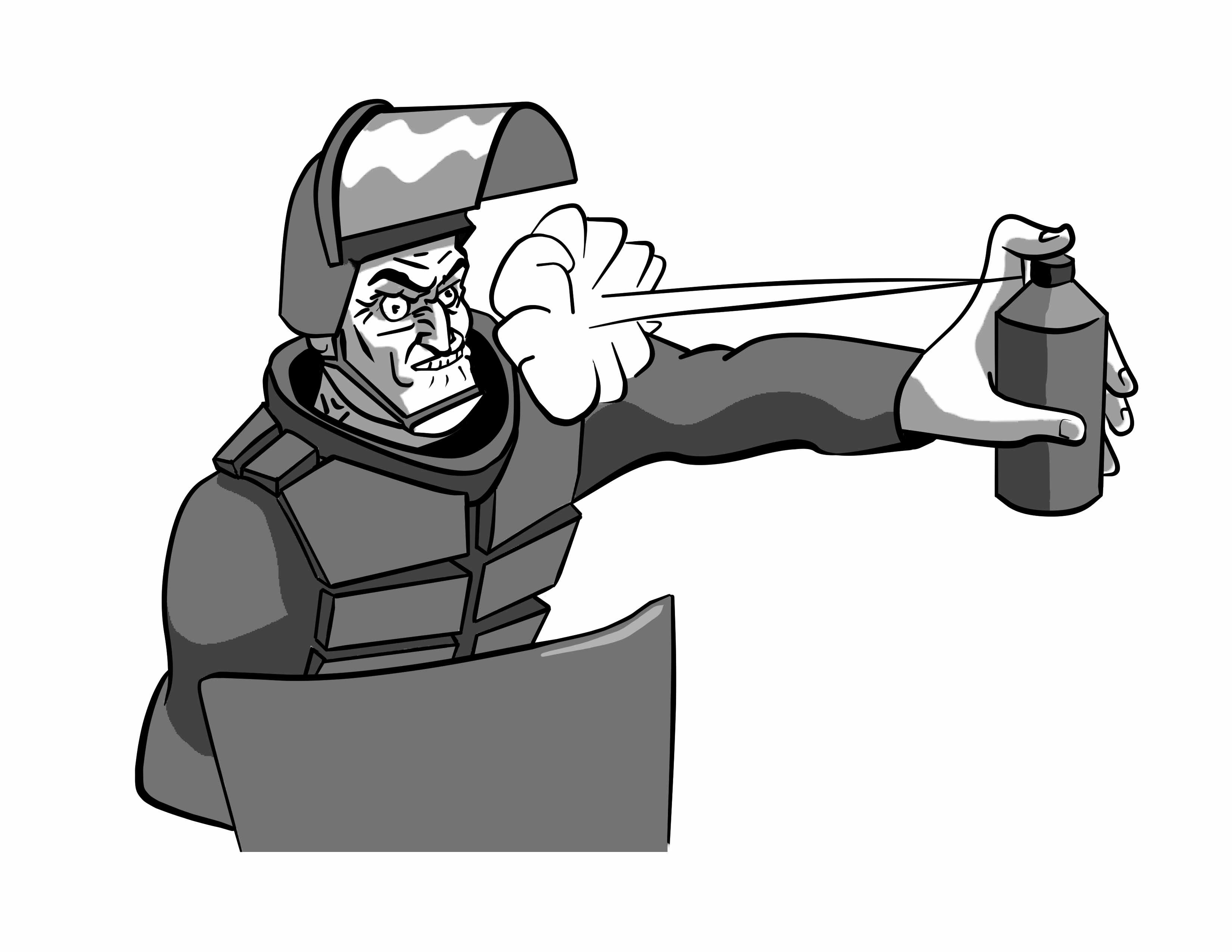
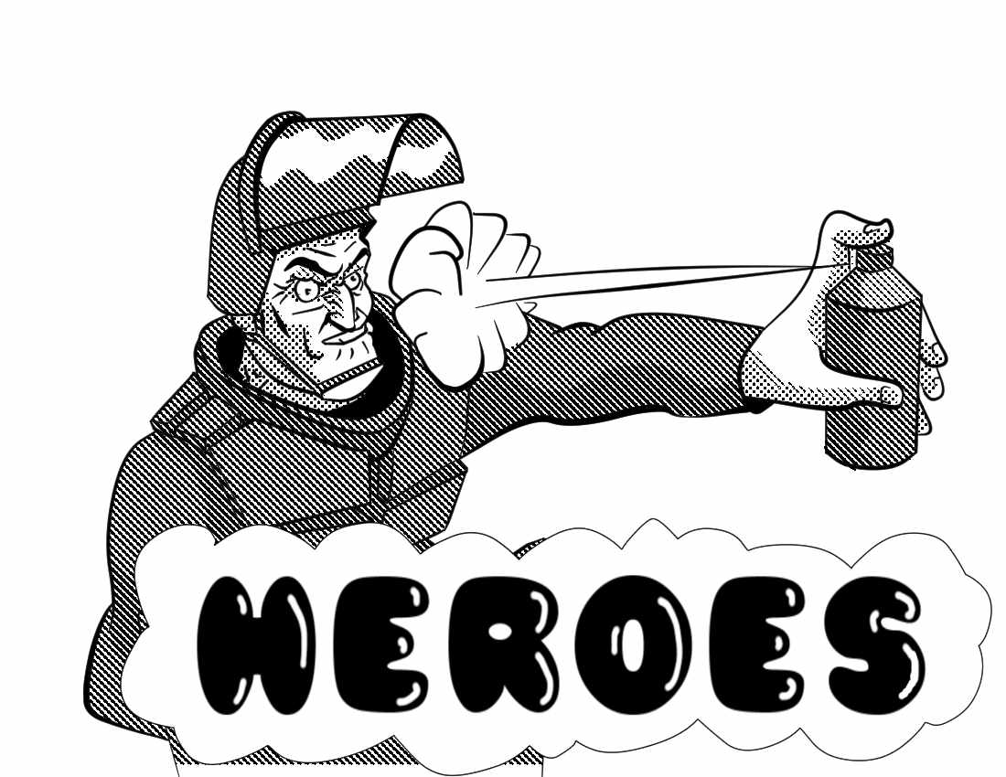
Finished one-color graphic complete with halftones based on 100 mesh density.
Marketing
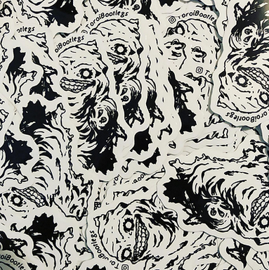
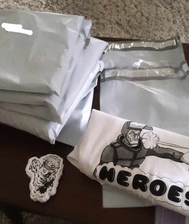
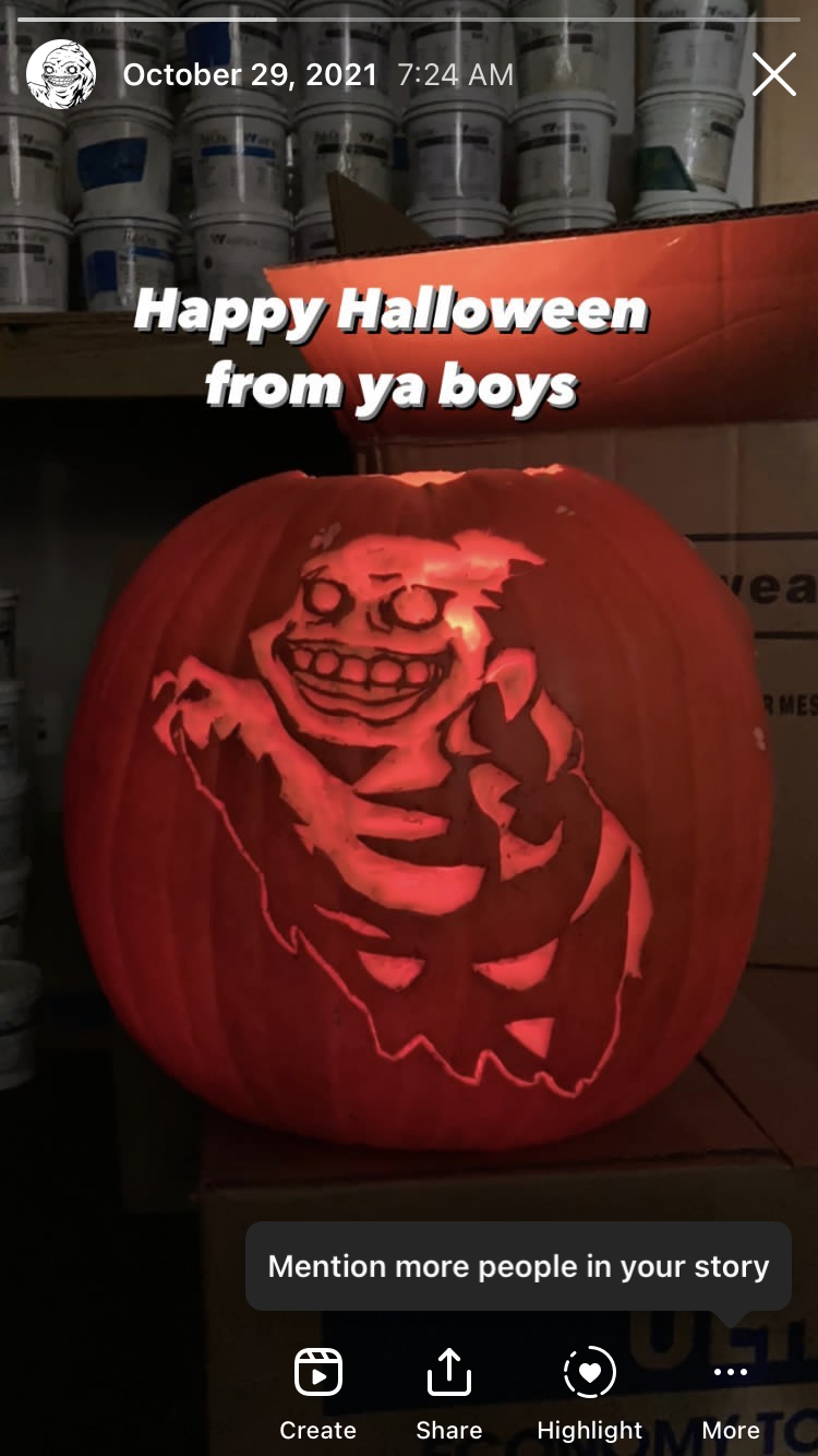
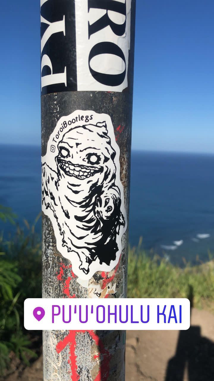
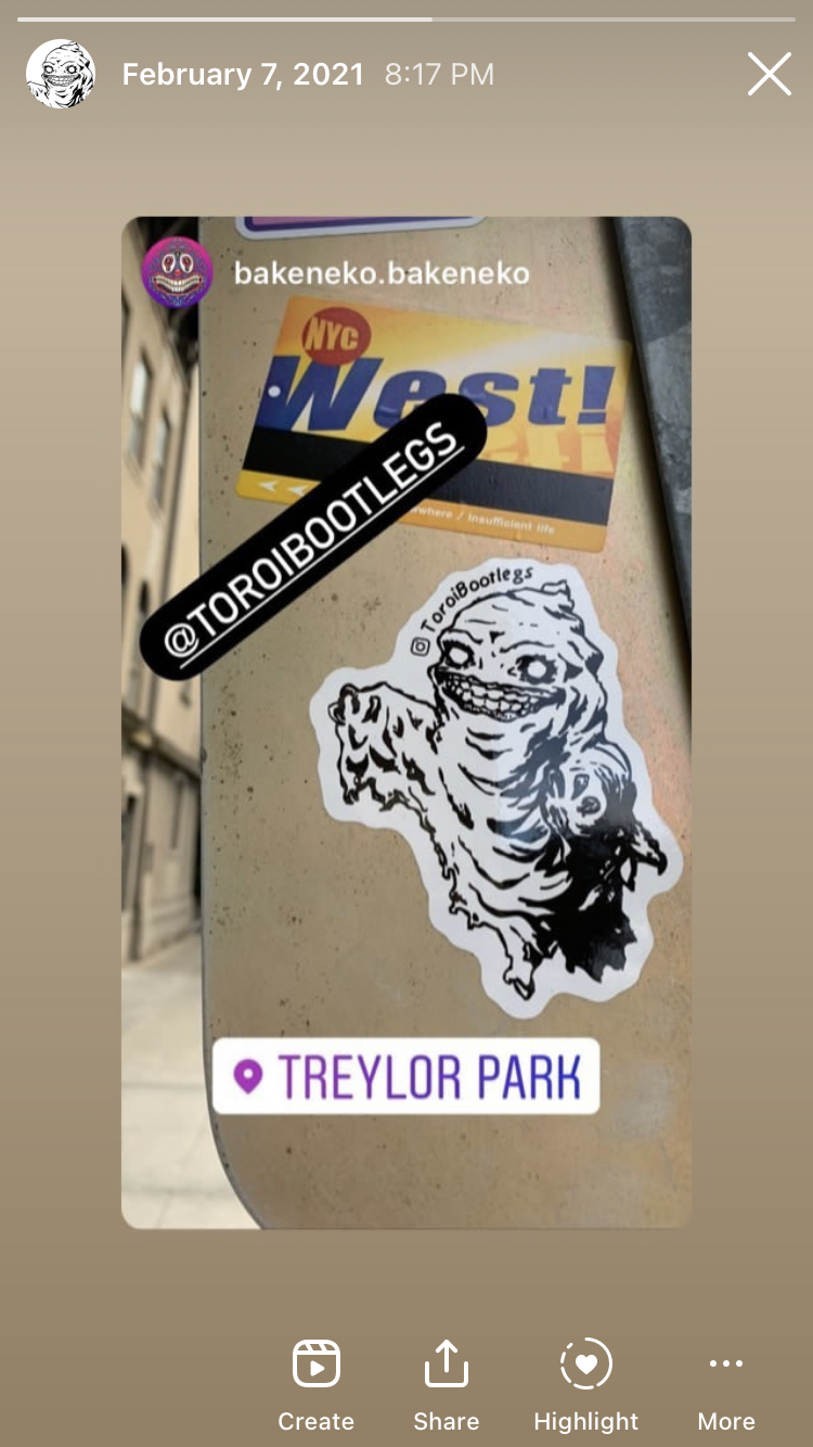
We curated a small but loyal following through social media, pop-up shops, and promotional materials (for example, stickers).
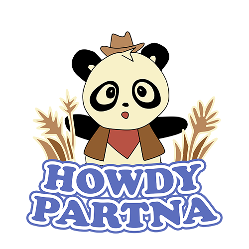
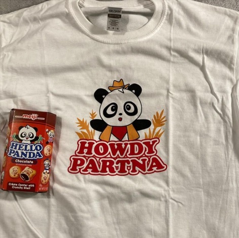
Howdy Partna
Print design and 3-D design.
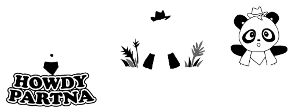
This project started as a simple parody graphic intended for screen printing. Its simplicity made it ideal for use in a 3-D design experiment utilizing Blender.
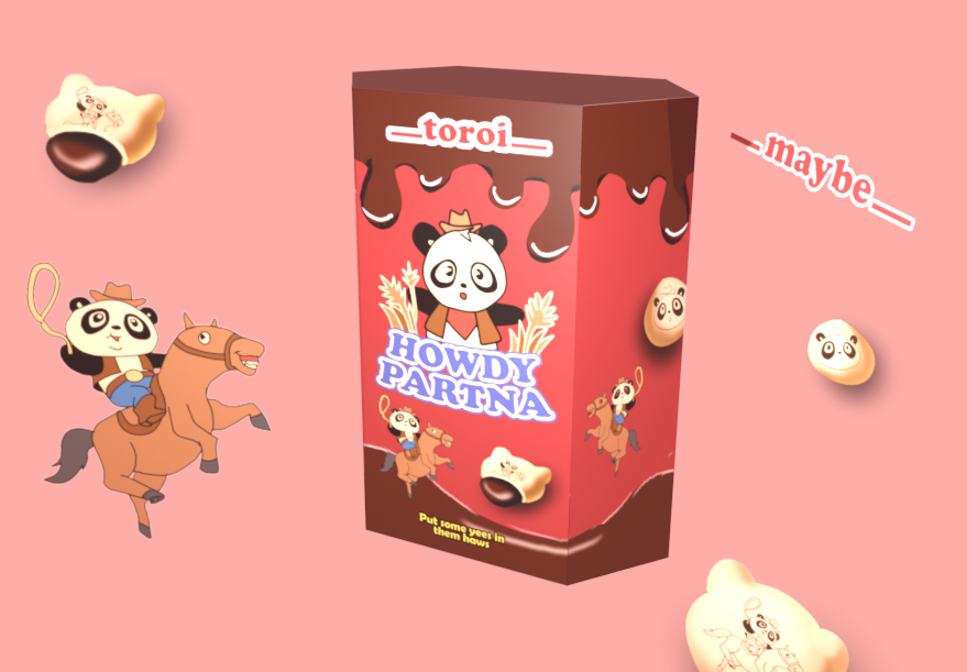
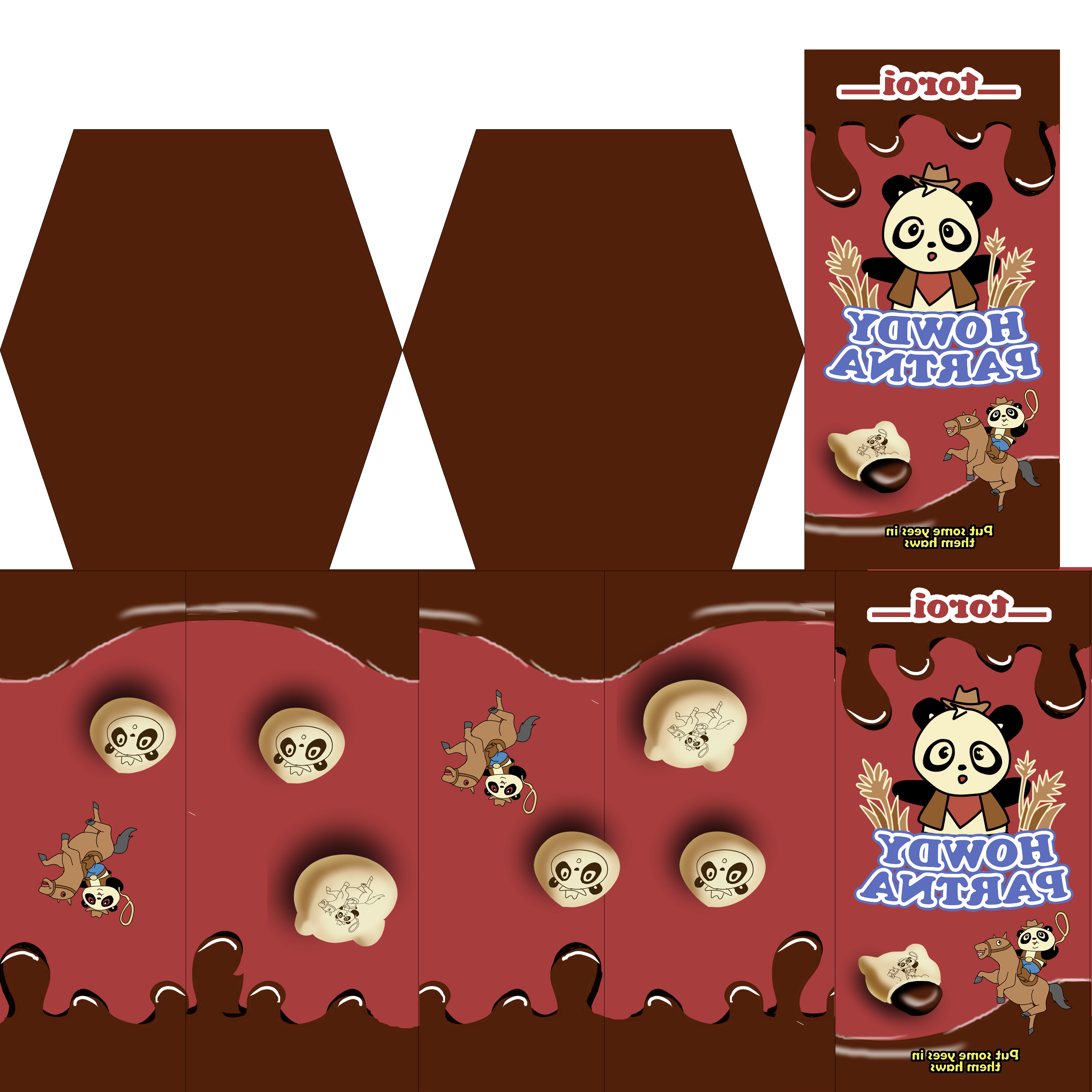
I grew up eating Meiji's Hello Panda snacks. I was fascinated by the colorful boxes and the deliciousness they contained. Later, I grew taste buds. I became less impressed by the snack itself and more impressed by its fun, hexagonal packaging complete with curved typography and cute characters.
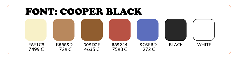
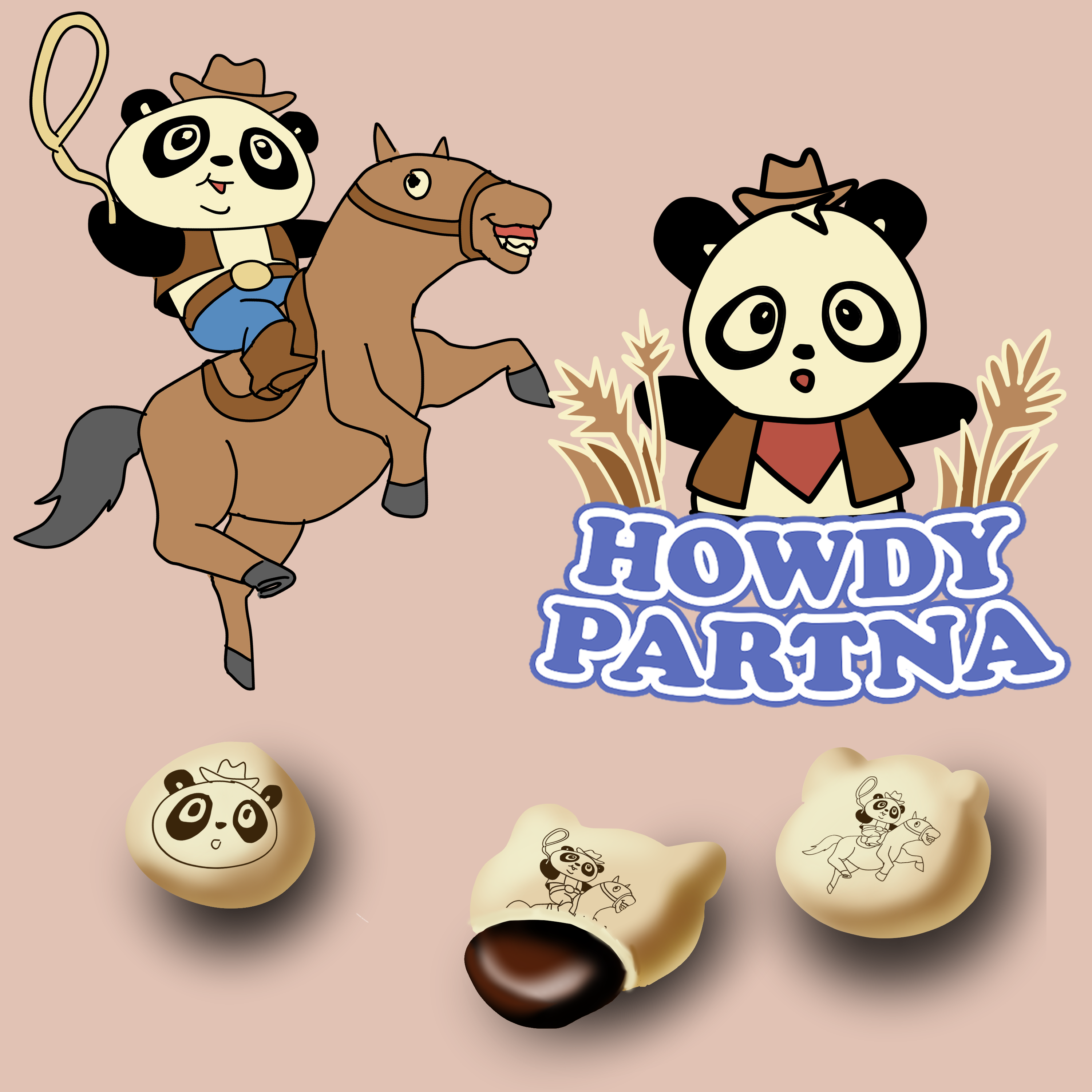
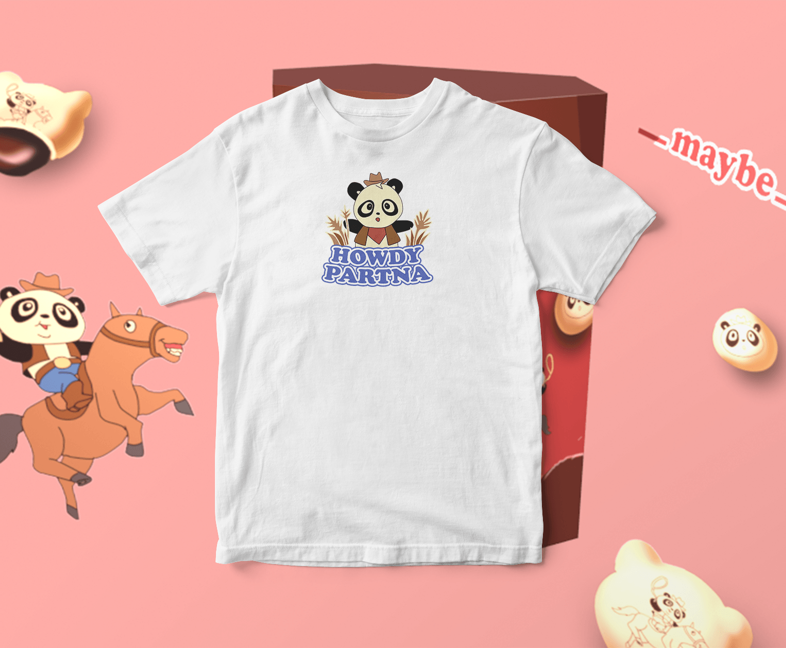
Repurposing the design entailed creative liberties. It meant illustrating something new and making different color choices. I wanted to print the design onto shirts, which meant matching Pantone. However, the final product incorporated fewer colors than the initial design. Developing seven individual screens and color matching five different inks was far too ambitious for a side project. I made a small batch of Howdy Partna shirts and had the idea to recreate Meiji's packaging in Blender to promote them. I slogged on forum after forum until I finally created something close to my vision. I posted a mock-up to my freelance Instagram page and quickly sold most of the batch.



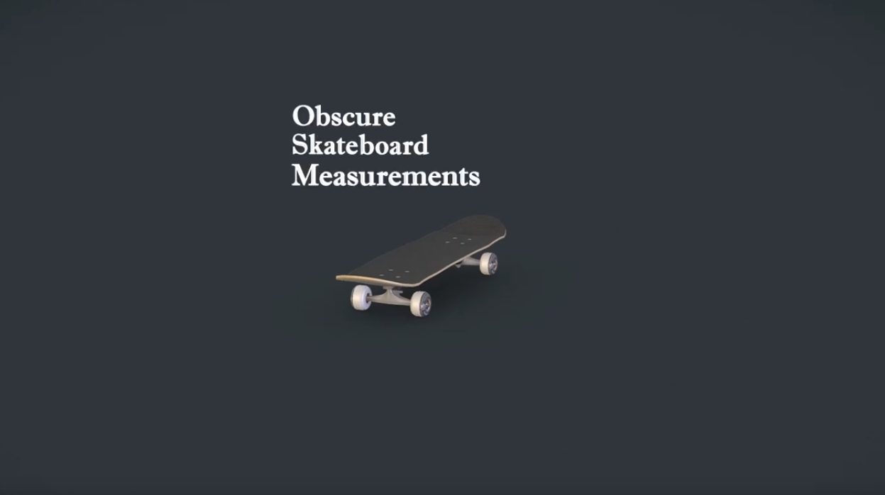
Skateboard Measurements
Motion graphics.
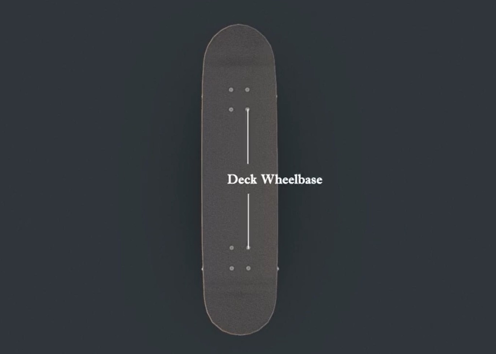
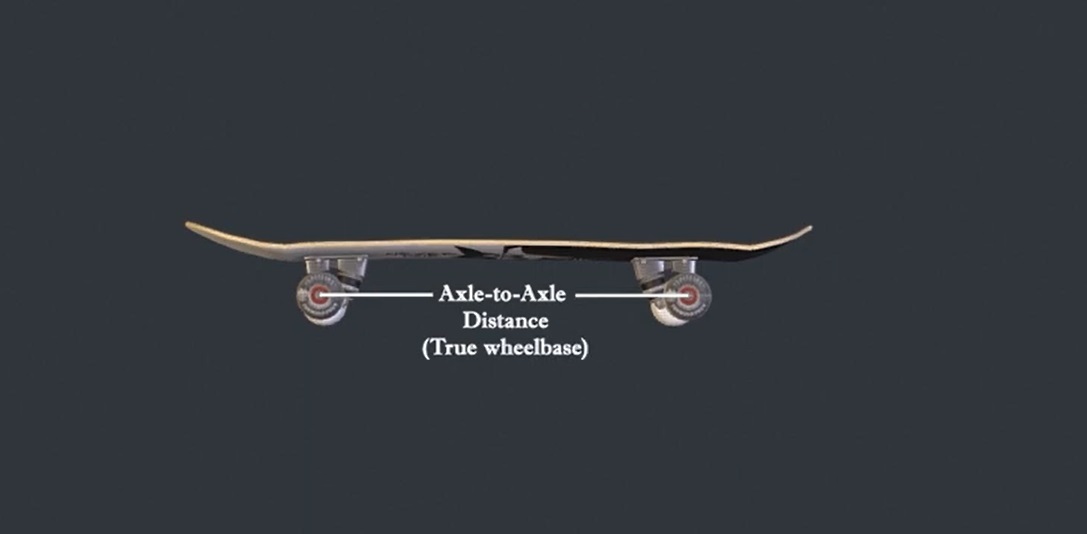
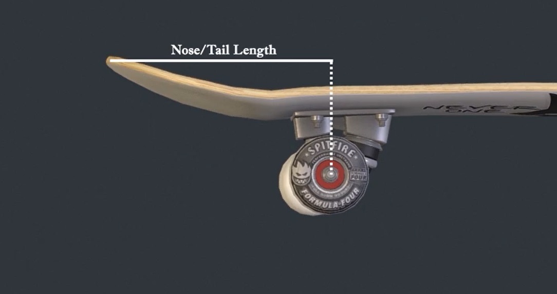
Skateboard wheelbase has been discussed ad nauseam within the community. Paul "Skateboarding Professor" Schmitt proposed that skateboarders should not only measure the skateboard deck wheelbase, but should also examine the axle-to-axle distance to measure their skateboard wheelbase to account for truck-axle offsets caused by variance between truck brands and models (Source: https://www.youtube.com/watch?v=zbzxSTC7WCk). Currently, traditional nose/tail measurement consists of measuring the surface distance along the top of the skateboard between the tip of the deck and the outer-most hardware holes. The flaw to applying this measurement to completes is that it only accounts for the innate nose/tail length of the deck itself.
Skateboarders should also measure the horizontal distance between axle and nose/tail tips, instead of the hardware holes. The reason this measurement is important is because truck-axle offset affects nose-tail length by modifying the distance between the tip of the nose/tail and the fulcrum through which pop transfers. This means modified pop timing and variable pop yield. By factoring effective nose/tail length, I believe skateboarders will have a more complete picture of their skateboarding setups. Truck height is not modified by deck wheelbase and does not need revision.
3-D asset used: https://sketchfab.com/3d-models/skateboard-free-model-5fb8302331154d0b80e7aa9352a3b664


Asshole Insects
Writing, Research, Motion graphics, Animation, and Voice-over.
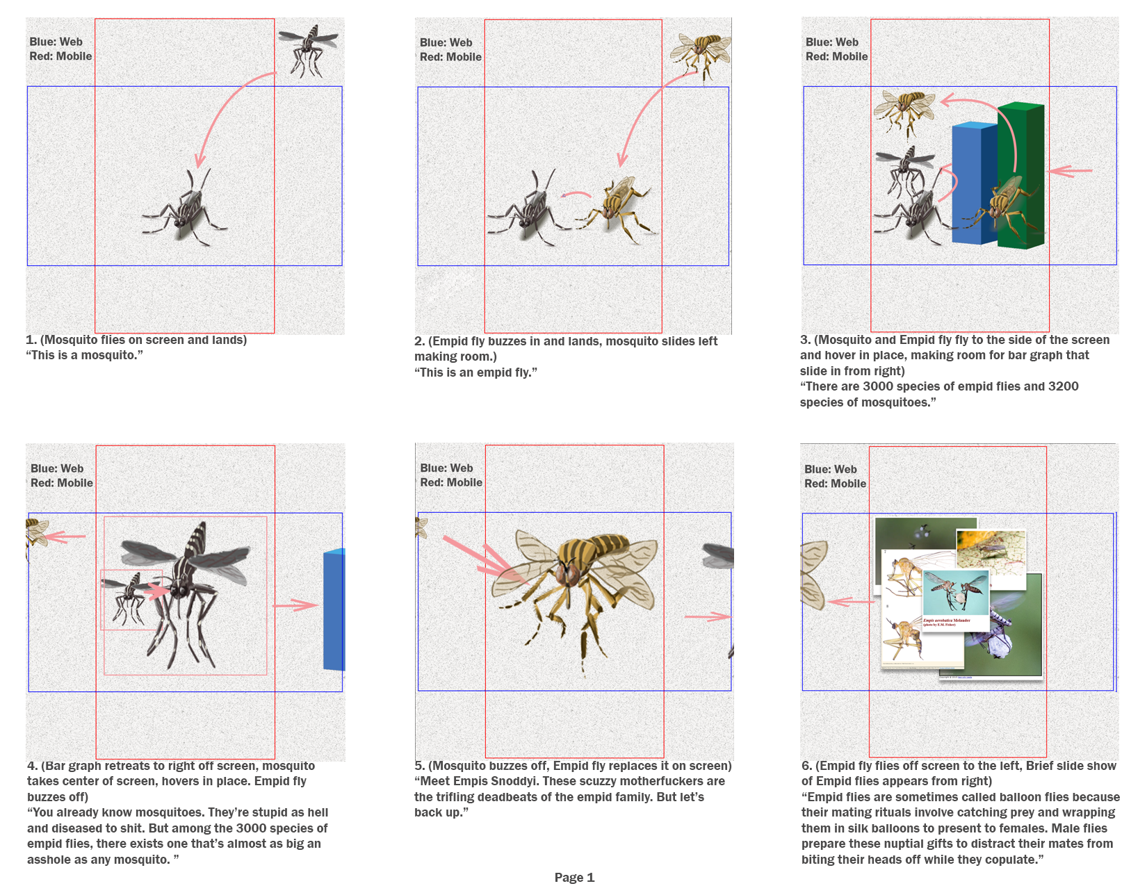
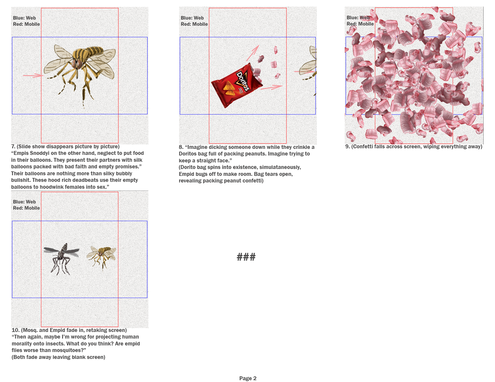
I first made a bar graph motion graphic complete with a few animation principles like squash-and-stretch and anticipation. It was only afterward that I realized the folly of working on assets before having a script. I wrote the script and made 2-D stills in Photoshop for the storyboard. I made then broke apart the artwork and animated the resulting assets in After Effects as I pieced the story together. I recorded the voice-over and edited the footage and audio in Premiere. The focal point in the video was the voice-over and script. An authoritative tone combined with a practiced vulgarity enhanced the story by taking on the perspective of someone who knows the material well enough to speak casually about it. The language was accessible, but not reductive. John Gardner would be proud of me, I ditched the clunky and unnecessary.